Apple

It is one of the biggest consumer electronics and Software Company, best known for products like Macintosh, iPod and iphone. Steve Jobs, Steve Wozniak, and Ronald Wayne had together setup Apple in 1976, to sell their hand-built computer Apple I. They had offered their product to HP first but were declined by them. I think HP would still be regretting this today.
The road to success wasn’t easy for Apple, and Wayne liquidated his share in the company for a mere $ 800. After the launch of Apple II in 1977, things started to look up for Apple and we all know what heights the company has reached since then.
Apple II was successful mainly because it had colored graphics. Great and simple design, has always been the USP (Unique Selling Proposition) for Apple, and their logo is no exception. When Apple was started, the logo was a complicated picture of Isaac Newton sitting under a tree. This had been designed by Jobs and Wayne, with the inscription: “Newton … A Mind Forever Voyaging Through Strange Seas of Thought … Alone.” Frankly, I don’t think it was just a coincidence that Apple had slow sales during this period.
However, Steve Jobs hired Rob Janoff to simplify the logo, which turned out to be a great idea. Rob created the ‘Rainbow Apple’ which was the logo for company till 1998. There are many rumors as to why Rob had chosen to create such a logo. One of them says that the Apple was a tribute to Newton (discovery of gravity from an Apple), and since the USP for Apple at that time was colored graphics, it had the rainbow colors. Another explanation exists that the bitten apple pays homage to the Mathematician Alan Turing, who committed suicide by eating an apple he had laced with cyanide. Turing is regarded as the father of computers. The rainbow colors of the logo are rumored to be a reference to the rainbow flag, as homage to Turing’s homosexuality.
Janoff, however, said in an interview that though he was mindful of the “byte/bite” pun (Apple’s slogan back then: “Byte into an Apple”), he designed the logo as such to “prevent the apple from looking like a cherry tomato.”
When Apple launched the new iMac in 1998, they changed their logo to a monochromatic apple logo, almost identical to the rainbow logo. Now, the Apple logo comes with nice gradient chrome silver design. It is one of the most recognized brand symbols in the world today, and the shape is what identifies the company more than the color.
Shell

Back in 1900, when the company was started the logo was a realistic and simple shell which lies flat on the ground. This was a pectin or scallop shell, but today the company has a logo which is bold, colorful and much more simplistic.
The evolution of the logo began after 1915, when rendering enabled the company to reproduce its identity easily. This is visible in the 1930 logo for the company. When the company started a project in California, it added the red and yellow colors to the symbol. The colors help Shell to stand out. Additionally, these are the colors of Spain, where many Californian settlers were born, which might have helped the company to create an emotional bond with the people.
With the advent of internet and fax machines over the later years, it became necessary for the company to simplify their logo, which would prevent it from being distorted in small images. The 1971 logo designed by Raymond Loewy is very simple as compared to the earlier logos.
This has helped the company because this logo is more memorable and recognizable, accountable to the simplicity of the logo. The 1971 logo is still used by the company albeit with minor changes, but it has become so recognizable that it often appears without the company name now.
Xerox

The Xerox Company used to be known as the Haloid Company almost 100 years ago. But in 1938, Chester Carlson invented a technique called xerography which we today call the photocopy technique. Unfortunately no one was willing to invest in his invention, and many big giants like IBM, GE, RCA and others decided not to finance this invention.
But Haloid Company decided to go with Chester and made the first photocopying machine named Haloid Xerox 14. As can be seen in their logos, the original Haloid word which was prominent in the company’s logo before 1961 was completely replaced by Xerox due to the immense success of this idea.
They retained almost the same logo from 1961 to 2004. But in 2004 there was a problem with the Xerox books and it tried to reinvent itself with a new logo. People associate the company only with photocopy machines, and that has been a major problem for Xerox.
The company changed its logo in 2008 to get away from this stereotyped image, by changing the font of the word. They also added a ball which has a stylish X instead of their ‘boring’ X in earlier times According to Anne M. Mulcahy, Xerox’s chief, that little piece of art represents the connection to customers, partners, industry and innovation.
BMW

BMW or Bayerische Motoren Werke AG (Bavarian Motor Works) was originally founded as an aircraft company. The aircrafts manufactured were painted with the colors of the Bavarian flag, which is the color of BMW logo. Another explanation is that when the pilot used to sit in the plane he would see alternating segments of white and blue due to rotation the plane propeller (blue being the sky).
The major business of BMW was to supply planes to the German army during World War I. But after the war they were forced to change their business. It made railway brakes, before making motorized bicycle, motorcycles and cars.
The logo itself hasn’t changed a lot during the years, but now has a more stylish look due to the different gradients. The unchanged logo has made it easier for people to remember and has given the company more recognition.
Nike

Nike probably got the best deal amongst all companies when Caroline Davidson designed its logo for just $35 in 1971. The main part of the logo hasn’t really changed with time. However, I don’t understand why they waited for 7 years before they realized that the text and the swoosh were overlapping each other.
As the brand gained recognition, the company name was dropped from the logo, which made it more simplistic and memorable. The company has different variations of this logo for its various departments like Skate, Soccer etc.
06. IBM

As you would observe from the logos above that IBM was earlier known as The International Time Recording Company (ITR), whose major products were mechanical time recorders, invented and patented by Willard L. Bundy in 1888. So in the earlier periods the logo of the company had ITR inscribed on it. Later in 1911, ITR was merged with the Computing-Tabulating-Recording Company, which is why you will see that both ITR and CTR are there in the 1911 logo.
In 1924, the Computing-Tabulating-Recording Company adapted the name International Business Machines Corporation. The ornate, rococo letters that formed the “CTR” logo were replaced by the words “Business Machines” in more contemporary sans-sarif type, and in a form intended to suggest a globe, girdled by the word “International.”
In 1947, IBM decided to drop the globe from its logo, which was by then quite familiar amongst the people. The logo was not the only change in 1947; it was accompanied by a change in business from the punched-card tabulating business to computers. The typeface of this logo was called Beton Bold.
In 1947, IBM decided to drop the globe from its logo, which was by then quite familiar amongst the people. The logo was not the only change in 1947; it was accompanied by a change in business from the punched-card tabulating business to computers. The typeface of this logo was called Beton Bold.
In 1956, before Thomas J. Watson, Sr died he appointed Tom Watson, Jr. as the CEO. Tom Watson, Jr. decided to project the beginning of a new era in the company, for that he changed the company’s logo as well as the actions. Paul Rand designed the new logo which represented that the changes in the company would be subtle and will not disrupt the continuity. Also, the new logo looked more solid, grounded and balanced.
Another change in the logo was designed by Paul Rand which had stripes instead of the solid font. It depicted ‘speed and dynamism’. Since, then the logo has more or less remained the same, and the design has been recognized and replicated all over the world.
Canon
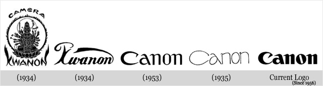
The company had always wanted a global perspective, and the logos reflected the same as early as 1934. A specialized advertising designer had created the logo which included typeface never seen before in Europe or North America.
The first camera launched by the company in 1934, was named as Kwanon, after the Buddhist goddess of mercy. The logo included the wordings and a picture of the goddess with 1000 arms and flames.
As the years went by, like all other logos we have seen above, the company strived to make the logo as simple and memorable as possible. The logo had only been trademarked in 1935, and after that a lot of designing work went into making the logo more balanced. After 1956, the logo hasn’t been changed, but the designing effort is clearly visible in their simple but classic logo.
Google

The clarity of thought is visible in the company’s logo right from the very beginning, when in 1996 two Stanford University computer science graduate students Larry Page and Sergey Brin built the search engine.
The name of the search engine is derived from Googol (meaning one followed by 100 zeros). Google’s first logo was created by Sergey Brin, after he taught himself to use the free graphic software GIMP. Later, an exclamation mark mimicking the Yahoo! logo was added. In 1999, Stanford’s Consultant Art Professor Ruth Kedar designed the Google logo that the company uses today.
Kodak
Interestingly, Kodak was the first company to integrate its name and looks into one symbol in 1907. After 1935, Kodak predominantly used yellow and red colors and the complete name of the company. First time the Kodak name was completely written in the logo in 1935, which began the use of yellow and red colors as well.
In 1960, they tried to show a flip page as a logo, but was changed to a box and graphic “K” element in 1971. I think the logo in 1971 was quite trendy, but it might have been a little complex. Retaining the 1971 concept, there was a slight variation in the font in 1987. The new font looked contemporary.
Again, like other companies, Kodak decided to simplify their logo in 1996, and removed the boxes. The red color gives a more brighter and structured feel of the company. In 2006, again a slight variation was made in the logo with a rounded ‘a’ and ‘d’, to give a contemporary look.
Microsoft

The Microsoft story began in 1975, when Bill Gates and his friend Paul Allen coded the first computer language for a PC and named it BASIC. Soon they named their partnership as Micro-Soft which explains the first logo of the company.
They changed the logo in that year itself and dropped the hyphen too. For the next 12 years, the logo had a distinctive O. The employees called this as “Blibbet”. It is said that at that time, the Microsoft cafeteria even had a double cheeseburger named “”Blibbet Burger”.
When a new logo came on in 1987, there was a campaign within the company to “Save the Blibbet”. But, this couldn’t stop the company from adopting a new logo. The logo designed by Scott Baker, came to be known as “the Pacman logo” due to the distinctive cut in the O.
In 1994, they integrated their tagline ‘Where do you want to go today?’ within the logo. This was widely mocked and the company kept trying different taglines like People Ready, Start Something, Making it Easier etc.
The new 2008 logo has all the text in Italics (including the tagline), but the look of the logo has remained pretty much the same. Basically, the company is so well renowned already, that I don’t think the logo needs to change, since people already recognize and connect with it worldwide.
Volkswagen

Volkswagen means ‘People’s car’ in German. The history of the company is tied with Adolf Hitler.
Before the rise of Hitler, the German economy was in a very bad shape; as a result people couldn’t afford to buy cars. In 1933, Hitler raised the idea of an inexpensive car in the Auto show.
Before the rise of Hitler, the German economy was in a very bad shape; as a result people couldn’t afford to buy cars. In 1933, Hitler raised the idea of an inexpensive car in the Auto show.
In 1934, Ferdinand Porsche met with Hitler to design the car. Hitler gave him all the specifications of the car and Porsche promised to deliver the design. In 1937, the Gesellschaft zur Vorbereitung des Deutschen Volkswagens mbH was created (it became simply Volkswagenwerk GmbH a year later). In 1938, Hitler opened a state funded Volkswagen factory in Walburg. It was suppose to produce commercial cars, but it was used to churn out military cars. It was only later found that Hitler had intended to use the Porsche car as a military vehicle only, which could carry 3 men and a machine gun.
After the WWII, Britishers took over the company. They renamed the car as Beetle. Surprisingly all the car makers like Fiat and Ford declined to take ‘free control’ of the Volkswagen factory. So, it was returned to the German government, and went on to become one of the world’s bestselling cars ever.
The first logo was designed by Franz Xavier Reimspiess, a Porsche employee during an office logo design competition. The main part of the logo hasn’t changed much, but understandably after the WWII, they got rid of the design around the circle which seems to be inspired from the Nazi flag. I love the colors that were added in 2000, to the logo which was built after WWII, it depicts a positive change in the company and the ability to adapt to the new millennium.
MasterCard

In 1966, seventeen bankers formed a federation for the reciprocal acceptance of their credit cards. They called this federation as Interbank and hence, the first 1966 logo. The ‘i’ was used to identify the participating members of Interbank Card Association.
In 1969, the name was changed to Master Charge. The new logo had the two familiar intersecting circles which make sense when we think about the interbank card business. Also, the ‘i’ was retained at the bottom to show continuity and also to make it easy for people to recognize their earlier familiar logo.
Finally, in 1979, the name MasterCard was adopted and they lost the ‘i’ from the logo. In 1990, bold colors were adopted which also made it easier to recognize the 23 horizontal bars between the two circles, which I think denoted the idea of multiple simultaneous interbank relationships. The logo looks more contemporary and simple, with an italic, sans-serif typeface.
In 1996, a more prominent font replaces the old font, and the number of bars was also reduced, resulting in a simple and powerful logo. The Brand Mark’s visibility, recognition, and overall brand image are improved, with new features including larger lettering highlighted with a drop shadow, fewer interlocking bars within the red and yellow circles, and a new dark blue background for use on decals and signage.
Mozilla Firefox

An open source web browser, created by Dave Hyatt and Blake Ross, was first of all named as Phoenix, which is visible in their first logo in 2002. Due to some trademark issues, the name had to be changed to Firebird, but the name was chosen so that they would be able to retain the same logo.
Unfortunately, this name also had trademark issues because of existing software. Then, they finally got lucky and chose the name Firefox, which has become one of the favorite and most used browser worldwide. In 2003, the now famous logo was designed by professional interface designer John Hicks.
The logo depicted a Firefox engulfing the whole world, which also signifies the global reach that the company strived for. There has been a minor change in the logo since then, with the colors of the continents using a lighter blue color, just to differentiate them better from the oceans.
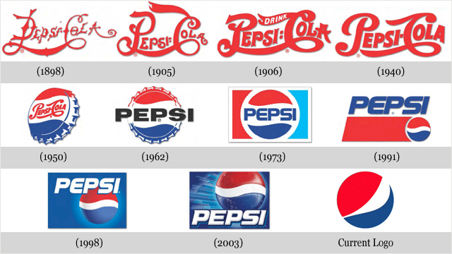
Today, one of the biggest soft drinks company, was first started by Caleb Bradham in 1890’s. Initially named as Brad’s drink the name was quickly changed to Pepsi-Cola, which is visible in the first 1898 logo. Finally in 1903, the name was trademarked and hasn’t been changed till date.
In the early years, Brad made custom logos for the brand as it became more famous. In 1933, the company was bought by Loft, Inc. The company changed the bottle size from 6 to 12 oz. and came up with the ‘Refreshing and Healthful’ logo.
However, the major breakthrough in the Pepsi logo design came in 1940’s. Walter Mack, the CEO of Pepsi came up with the idea of a new bottle design, with a crown having the Pepsi logo. The ‘Pepsi Globe’ emerged when USA was in WWII, and to support the country’s war efforts, Pepsi had a blue, red and white logo.
This logo became hugely popular, and went on to be the identifier for the company. As a result, in 1950 and 1962, this bottle cap with the swirling blue and red became prominent in the company logo. During the 1960’s when it became even more popular, the script was changed from the curly red, and the main attraction was on the bottle cap in the logo.
We see the first appearance of the Pepsi Globe instead of the bottle cap in 1973. The typeface was made smaller so as to fit in the globe. The Pepsi Globe was “boxed in”, with a red bar coming in from the left and a light-blue bar coming in from the right.
In 1991, the typeface was moved from inside the globe. The red bar was lengthened and the typeface came on the top of the globe. In 1998, the white background in the logo was replaced by the blue color, which also resulted in dropping the red horizontal band. The globe now had 3D graphic and larger than earlier versions. It might be that since, Pepsi and the globe touch each other for the first time in the logo, the name ‘the Pepsi Globe’ was given to the logo.
After 1998, it seems that Pepsi had decided to give the globe more prominence than the script itself. So, the globe came on top of the script in 2003, and in their current logo they have done away with the script altogether.
LG

LG was formed from two different companies named Lucky (chemical cosmetic company, 1947) and Goldstar (radio manufacturing plant, 1958). Though, these were different companies they were essentially owned by one person. In 1995, Lucky Goldstar was renamed to LG Electronics.
Actually, LG is a chaebol (a South Korean conglomerate), so there’s a whole range of LG companies that also changed their names, such as LG Chemicals, LT Telecom, and even a baseball team called the LG Twins. These companies all adopted the “Life is Good” tagline you often see alongside its logo. LG denies that their name now stands for Lucky Goldstar. They’re just “LG.”
Mercedes-Benz

The Mercedes-Benz was formed by the merger of two car companies – DMG (Daimler-Motored-Gesellschaft, founded by Gottlieb Daimler) and Benz & Cie, founded by Karl Benz. Both the companies were similar in their work and were situated in close proximity.
It was after the World War I, when the German economy was shattered, that both these companies decided to from a syndicate in 1924, and then finally merge in 1926, called Diamler-Benz.
In 1902, the logo for Mercedes was nothing more than the simple company name. However, it was changed to a 3 pointed star in 1909. The origin of this star came from a postcard by Diamler, where he had drawn a 3 pointed star which represented ‘making vehicles in land water and sky’.
After 1926, a new symbol for Mercedes-Benz came into picture, where the original logo of both the companies was merged into one. It combined the 3 pointed star of Mercedes and the laurel wreath of Benz.
Over the years, the symbol has been improved vastly in design and simplicity. It has been recognized as a symbol representing luxury and top tier cars.
General Electric

The company has a great history. It was formed in 1892 by the merger of Edison Electric Light Company (founded by Thomas Edison to sell his invention, the light bulb) and Thomson-Houston Electric Company.
The basic logo font face is still quite similar to what it was in 1892. Over time, a circle engulfing the company name has been added to the logo, which might be due to the increasing global presence and vision of the company. The current logo, which was designed by Wolff Olins, adds blue color to the logo instead of the black color which had been used in all the previous logos. Accompanied with the logo change was also a change in the tagline of the company from “We bring good things to life” to “Imagination at work”.
Nokia
‘Nokia’ in Finnish means means a dark, furry animal we now call the Pine Marten weasel. However, this has little to do with the current business and brand image. The origin of the company name, can rather be attributed to the setting up of the wood pulp mill (set up by Knut Fredrik Idestam), on the banks of Nokianvirta river in the town of Nokia.
The Nokia Corporation was formed as a merger of Finnish Rubber Works (which also used a Nokia brand), the Nokia Wood Mill, and the Finnish Cable Works in 1967. The company has sold a variety of products in the past including television, shoes, car tires and others. The evolution and the meaning of the logo is unclear due to the changing business over the years.
Ford
Henry Ford used to work for Thomas Edison. He founded two companies before settling on Ford. His first company went bankrupt after just two years, and he left the second company after just one year. However, the second company became Cadillac later on. His third company, founded in 1902, was called Ford & Malcomson, Ltd.
He was unable to pay the bills for parts in his third company, but some investors agreed to put money in the company, and it was renamed as Ford Motor Co. This is the company name in the first logo of 1903. The 1909 logo, which has a similar font as today’s logo was borrowed from Childe Harold Wills, who had made this font for his business card.
In 1912, the Ford logo was given a complete makeover, as compared to the earlier simplistic design. When a car was launched in 1927, called Model A, the famous blue oval was introduced in the logo. This was the shape and color, on which all future Ford logos have been made.
The company has experimented with different shape going from ellipse to circle, and even a diamond like shape in 1957. The 1976 logo was essentially, the last major change in the symbol, and is very similar to their current logo. Finally, in 2003, the company released a new logo, which came to be known as “Centennial Blue Oval”.
Wal-Mart

The company has tried out various colors and variation of the word Walmart over the years. In 1962, when Sam Walton started, the company, the logo had simply the word spelled in a very basic design.
The logo was changed in 1964, when a hyphen was added and the color was also changed from blue to black. This came to be known as the “Frontier Font Logo”. The 1968 logo shown here is the discount city logo, which was mainly used for uniforms, in-store signing etc, but it was never used to advertise or even in annual reports.
The 1981 logo changed the curly font to a more solid font, giving the company a more stable, established and balanced look. The hyphen in this logo was replaced by the star in 1992, and the familiar blue color of the logo returned for the first time after the company’s inception.
The 1981 logo changed the curly font to a more solid font, giving the company a more stable, established and balanced look. The hyphen in this logo was replaced by the star in 1992, and the familiar blue color of the logo returned for the first time after the company’s inception.
Walmart is probably one of the few companies, who have tried so many logos, but their current logo is more like the original logo, other than any other intermediate logo. The font differs a little from the original and is indeed more stylish, but the ‘Walmart’ word without a break appears for the first time after 1962. They have kept the star from 1992, but moved it to the end.


